Paint Color Ideas for Every Room: How to Choose Without Regret
The wrong paint color is one of the most common and most expensive home design mistakes. This guide covers the best paint colors for every room in 2026 — and how to test them on your actual walls before buying a tin.
The wrong paint color is one of the most expensive and most common home design mistakes. A color that looked perfect in the store reads completely differently on four walls under your specific light. Repainting costs $2,000–$5,000 for a typical room — and it's entirely preventable.
This guide covers the best paint color ideas for every room in 2025, how to match colors to your room's light conditions, and how Homai's Paint Visualizer lets you test any color on your actual walls before buying a single tin.
Why Paint Color Is So Hard to Choose
The chip, the screen, and the painted wall are three completely different experiences of the same color.
The Light Problem
Paint colors look different depending on the ambient light in your specific room. A warm grey that looks sophisticated in the store looks lavender in a north-facing room with cool indirect light. A warm terracotta that looks rich and inviting in an east-facing room looks overwhelming in a south-facing room with bright direct sun.
Professional designers test paint colors on actual walls — painting sample patches and observing them at different times of day — before committing. Homai's Paint Visualizer simulates this by applying any color to a photo of your actual room in your actual light conditions.
The Scale Problem
Colors look darker and more saturated on large surfaces than on small chips. A deep sage that reads as muted and subtle on a 2cm chip reads as bold and strong on four walls. A warm terracotta that looks inviting on the chip can feel overwhelming at room scale.
The Context Problem
Paint color doesn't exist in isolation. It interacts with your flooring, your furniture, your ceiling, and the colors visible from adjacent rooms. A chip tells you nothing about how the color will read in that context.
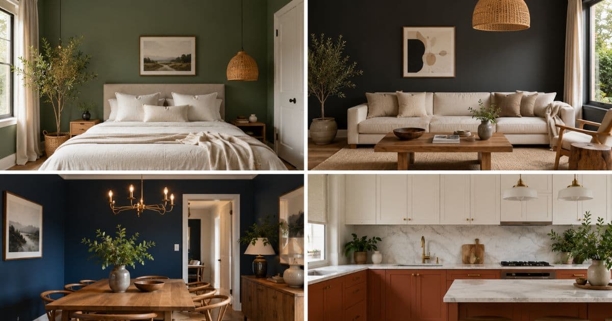
The Best Paint Colors for 2025
Color trends in 2025 share a consistent character: warmth, earthiness, and calm.
The Dominant Direction: Warm Earthy Neutrals
The defining character of 2025 interior color is warmth. Cool greys and blue-whites that dominated 2015–2020 are firmly over. The move is toward tones that feel organic — warm whites, earthy greens, muted terracottas, and charcoals with a warm undertone.
The colors that are everywhere in 2025:
| Color Family | 2025 Character | Best For |
|---|---|---|
| Warm white | Creamy, slightly warm — never cool | Universal base, any room |
| Sage green | Earthy, dusty, muted — not bright | Living rooms, bedrooms, kitchens |
| Warm charcoal | Dark with a warm undertone — never blue-black | Feature walls, studies, bold bedrooms |
| Terracotta | Warm, earthy, spiced — not orange | Dining rooms, feature walls, warm climates |
| Dusty blue | Muted, slightly grey — not bright | Bedrooms, bathrooms, calm spaces |
| Warm greige | Beige-grey with warmth — the new neutral | Transitional spaces, hallways, open plan |
Paint Color Ideas by Room
Living Room Paint Colors
The living room is the room where paint color has the highest visual impact — large wall areas and multiple light sources.
The safest choice: Warm white. A creamy warm white with a slight yellow or pink undertone (never cool) works in almost every living room, with almost any furniture. Dulux Lexicon, Taubmans Rice Bowl, Farrow & Ball All White (with warmth).
The most popular choice in 2025: Sage green. A dusty, earthy sage — not bright or cool — applied to a feature wall or all four walls. Works brilliantly with natural timber, linen, and the warm neutral furnishings that dominate current design. Dulux Bush Sage, Porter's Paints Dry Leaf.
The bold choice: Warm charcoal on a feature wall. Deep, dramatic, and currently very popular — particularly for living rooms with significant natural light where dark tones won't feel oppressive. Dulux Domino, Farrow & Ball Off-Black.
Use Homai's Paint Visualizer to test any of these on your actual living room before buying paint.
Bedroom Paint Colors
Bedrooms benefit from colors that feel calm at night — test in artificial light as well as natural light.
The most popular: Warm white. Simple, calm, works with any bedding or furniture. Easy to live with over time.
The design-forward choice: Dusty blue or pale sage. Both read as calm and restful at night. Dusty blue has warm undertones that look beautiful with warm timber and linen bedding. Sage green creates an organic, calming environment. Dulux Misty, Taubmans Misty Morning.
The bold choice: Deep terracotta or warm charcoal on the wall behind the bed (or all four walls for a committed design statement). Currently very strong in master bedrooms with quality lighting and natural materials.
The ceiling: Colored ceilings are increasingly common in bedrooms — a warm white ceiling in a room with sage green walls creates warmth and enclosure without feeling oppressive. Worth testing with Homai's Change Surface Color tool.
Kitchen Paint Colors
Kitchens often have mixed lighting — test colors under both natural and artificial light.
Wall colors: Warm white is the safest and most universally effective kitchen wall color. It makes the kitchen feel larger, cleaner, and more functional.
Cabinet colors (the more impactful choice): The cabinet color defines the kitchen's character more than the wall color. In 2025, the strongest performing cabinet colors are:
- Sage green — one of the most popular kitchen cabinet colors globally
- Warm white or off-white — classic, clean, works with almost any benchtop
- Navy — bold, distinctive, particularly effective with brass hardware
- Charcoal — dramatic and sophisticated, popular for modern or contemporary kitchens
- Warm timber veneer — brings warmth to kitchens dominated by hard surfaces
Use Homai's Change Surface Color to test cabinet colors on your actual kitchen photo before any painting or cabinet work begins.
Dining Room Paint Colors
Dining rooms are used primarily in the evening — test colors in artificial light.
The dining room is often the room where people take the most color risk — and where bold colors work best. Evening lighting means colors read differently; deep tones that might feel overwhelming in daylight create intimacy and drama by lamplight.
2025 dining room color directions:
- Deep terracotta — warm, rich, flattering under warm artificial light. One of the most-pinned dining room colors of 2025.
- Forest green — deep, sophisticated, elegant. Pairs beautifully with warm timber and brass.
- Warm charcoal — dramatic and versatile. Works as an all-four-walls color in dining rooms with good light.
- Warm white — if the dining room is open-plan and needs to connect to the living and kitchen areas.
Hallway and Entry Paint Colors
Hallways are often the darkest room — err warm and bright.
Hallways typically have no natural light or minimal natural light. Colors that look beautiful in bright showrooms can feel dark and oppressive in a hallway.
The rules for hallways:
- Always go warmer than you think you need — the hallway will always be darker than you expect
- Test warm whites before committing to a neutral — some "neutral" whites read grey or cold in low light
- Avoid cool greys and blue-whites — these amplify the cold feeling of low-light spaces
- Consider a slightly warmer tone than the rooms it connects — this creates a warm transition rather than a stark contrast
Study and Home Office Paint Colors
Productivity and focus vs warmth and calm — choose based on how you use the space.
For focus and productivity: a cooler, cleaner palette — soft blue-grey or soft green-grey creates a calm, focused environment without being harsh.
For warmth and creativity: a warmer palette — sage green, warm white, or deep terracotta on a feature wall.
The bold choice for a study: deep charcoal or forest green on all four walls. Studies are often small rooms where dark walls feel intimate rather than oppressive — and they look exceptional in photos.
How to Choose the Right Paint Color for Your Room
The process that professionals use — adapted for homeowners with Homai.
Step 1: Identify Your Room's Light Profile
- North-facing (Southern Hemisphere) / South-facing (Northern Hemisphere): Cool, indirect light — always go warmer than you think
- South-facing (SH) / North-facing (NH): Bright direct light — most colors work; bold colors are viable
- East-facing: Warm morning light, neutral afternoon — warm tones glow in the morning
- West-facing: Cool morning, golden afternoon light — earthy tones shine here
Step 2: Choose 3–5 Colors to Test
Based on your room's light profile and the guide above, select 3–5 colors across the range — one safe neutral, one medium option, one bold option. Don't pre-judge. See them all in the room.
Step 3: Use Homai's Paint Visualizer
Upload your room photo. Apply each of your 3–5 color candidates. Compare them in your actual room, under your actual light conditions.
The visualization in your specific room is dramatically more reliable than a chip in a store, a paint brand app template, or imagination.
Step 4: Test at Different Times of Day
For the final 1–2 colors, generate the visualization at the approximate light conditions of your room at different times of day — morning, afternoon, evening with artificial light. Colors that look great in one light condition can look wrong in another.
Step 5: Commit
With visual confirmation on your actual room, color decisions become easy. You've seen the result. You know it's right.
Frequently Asked Questions
What is the most popular paint color in 2025?
Warm earthy tones dominate: warm whites, dusty sage greens, warm charcoals, and muted terracottas. The cool grey trend of 2015–2020 has largely reversed.
How do I stop my white walls from looking grey?
Choose a warm white with a yellow or pink undertone, not a cool white with a blue undertone. Test on your actual walls with Homai's Paint Visualizer — cool whites often read grey in north-facing rooms.
Should I paint the ceiling the same color as the walls?
Not necessarily. A slightly lighter version of the wall color on the ceiling creates a cohesive, enveloping effect (popular in Japandi and maximalist rooms). A warm white ceiling against colored walls is a classic combination. Use Homai's Change Surface Color to test both options.
Is it worth paying for a premium paint brand?
Yes — premium paints offer better coverage, better durability, and more accurate color matching. The cost difference per tin is small relative to the labour cost of painting. Farrow & Ball, Little Greene, Dulux Weathershield for exteriors, and Taubmans or Dulux for interiors are the most recommended in Australian and UK markets.
Can I use Homai's Paint Visualizer for exterior paint colors?
Yes — use Homai's Exterior Redesign or Change Surface Color tools for exterior paint visualization.
Test Any Paint Color on Your Actual Walls — Before You Buy
Upload any room photo. Apply any color from any paint brand. See the exact result in your specific light conditions in seconds. Free to start at homaihq.com.
Try Paint Visualizer free → homaihq.com
Related: How to Test Paint Colors on Your Walls | Interior Design Styles | House Design Interior Design
Written by Homai
AI staging and interior design for real estate agents